There are a number of forum members who have certain expertise when it comes to image analysis.
I am completely out of my comfort zone with that sort of thing, so I need a helping hand trying to understand how the image below was created.
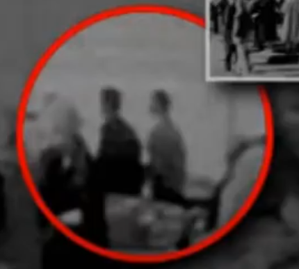
The identification of Lovelady in the above image has been described as "conclusive" and "definitive".
Even though the known testimonial evidence relating to this identification, when taken as a whole, completely refutes this identification (as I've been arguing on a different thread).
It has boiled down to so-called researchers simply ignoring the evidence because how can the "testimonial evidence affect what we can see with our own eyes?"
After all, just look at the level of detail in the shirt. It is clearly Lovelady's shirt because it is so distinctive and we can clearly see the pattern of it.
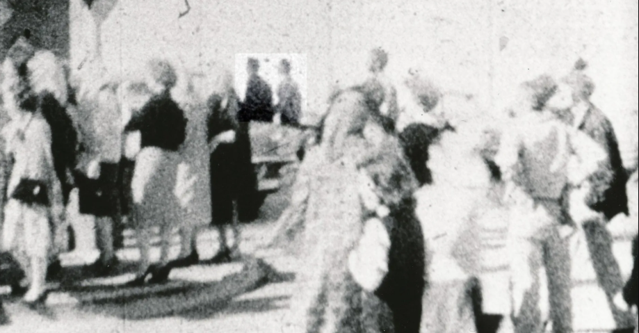
At some point in the debate on the other thread I posted this crop from the Gerda Dunkel footage:
I was struck by the lack of detail on 'Lovelady's' shirt.
There didn't seem to be even the faintest trace of it.
I knew Kamp had used Photoshop to sharpen the images but when I tried it I got nothing.
So I had a look on the Prayer Man website where other forum members kept pointing me towards to see if I could get a better understanding. In the part about the image Kamp writes:
"For starters, take a look at the Gerda Dunckel gifs below and check Loveladys shirt in the very first few frames and also check out the large still I snagged from PBS Breaking The News, click to enlarge, yes that shirt is checkered, compare it to other garments of a lighter colour or the polka dot coat which do not smudge due to motion and quality loss. Then look at Shelly, with his black suit and his facial and hair features."
I've already posted the Dunkel image and there is no checkered image there so he must be referring to the PBS image posted on the website, from which I got this image (all I did was blow the image up and crop it from the original image):
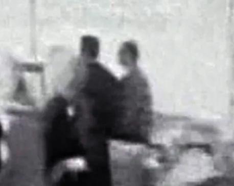
Now, with all the best will in the world, I'm not seeing the checkered pattern that Kamp is insisting is there.
I can see four pieces of rectangular, what I would call, photographic 'noise' impinging on the right side of' Lovelady' as we look at him and there is a similar effect bleeding over between the two men. But no checkered pattern.
If any of our resident images can make a comment on my assessment of this I would be grateful.
So, we then come to the image that the amazing level of detail on Lovelady's shirt appears to be taken from. As Kamp explains:
This...Scan of a Couch film still at first looks very harsh and doesnt overall have much information, but it does happen to show a lot regarding our illustrious duo. This print comes from the Richard E. Sprague Collection from the National Archives.
And this is where my complete lack of expertise kicks in.
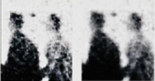
In the above image we can now clearly see that there is a defined pattern on Lovelady's shirt.
There is a square of a lighter shade around the two men. I don't know if it was like that when Kemp originally got the image or if this is a result of his work on the image. If it is I would really like to see the original image
But here's the thing I'm not getting. To my eye, the Sprague image (from which we get the "definitive" Lovelady) lacks an incredible amount of detail compared to this large crop PBS image:
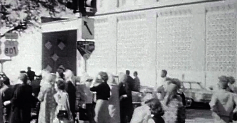
Note in PBS image, the pattern of the first floor 'windows',the concrete lattice in front of the windows, and then notice the complete lack of it in the Sprague image. Just compare the two images in general and we acn see that the PBS image is a far more detailed, yet the close-up of Lovelady in that image does not have any hint of the incredible shirt pattern in the inferior Sprague image.
Can anyone help me understand this?
LATER EDIT:
If anyone has, or can point me to, the Couch film that has the amazing level of detail please could you post it because every version I've come across so far is not anywhere near close the definition required
